
How to Choose the Perfect Interior Paint Color
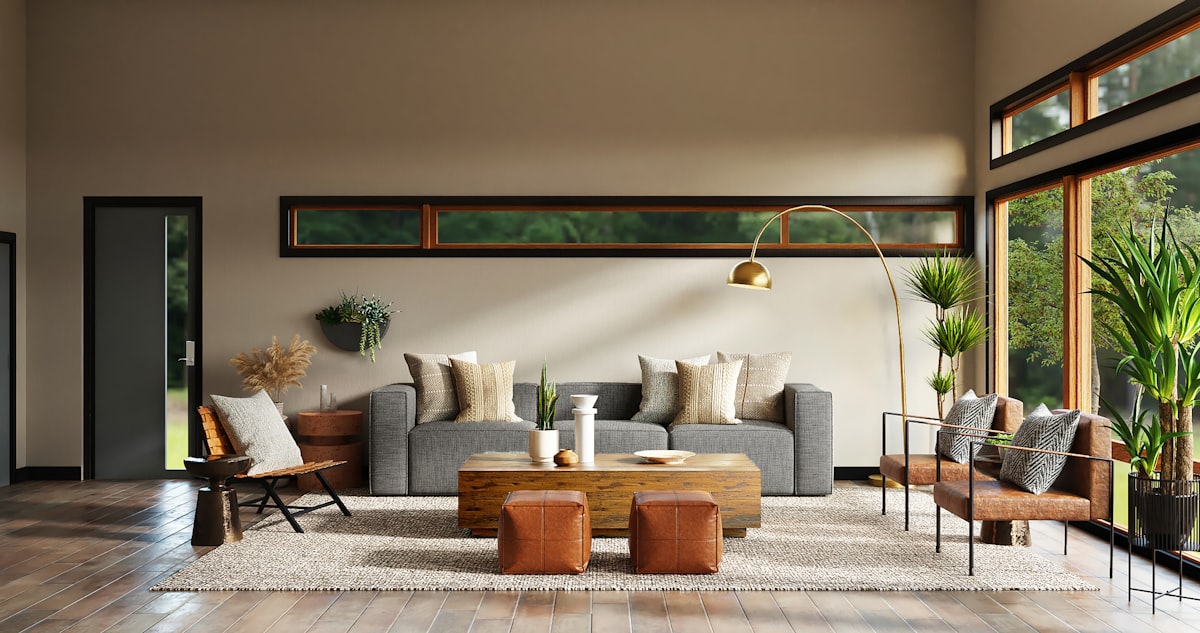
The right paint color can completely transform a room — but choosing one from thousands of options is genuinely hard. Here's the method our designers use every day.
Choosing the right interior paint color is one of the most impactful decisions you can make for your home. A color that looks stunning in a showroom or on a paint chip can look completely different on your walls once natural light, furniture, and flooring enter the equation.
Here’s the process our color consultants use on every project.
Start With the Fixed Elements
Before even looking at paint chips, catalog every element in the room that isn’t changing — flooring, furniture upholstery, kitchen cabinets, countertops, and tile. These are your anchors.
Look for undertones in those fixed elements. Is your hardwood warm and honey-toned, or cooler and ashy? Do your granite counters have blue-grey veining? Your paint color needs to harmonize with these undertones, not fight them.
Use the 60-30-10 Rule
A classic interior design principle that works every time:
- 60% — The dominant color (your walls). Should be calming and neutral.
- 30% — The secondary color (large furniture pieces, rugs). Complements the walls.
- 10% — The accent color (pillows, artwork, trim details). Creates visual interest.
When you’re picking wall paint, you’re choosing that 60% anchor. Go lighter and more neutral than your instinct tells you.
Test Before You Commit
Never skip sampling. Paint a 12x12 inch section of your actual wall and observe it at different times of day:
- Morning light — cool and directional
- Afternoon sun — warm and intense
- Evening lamp light — amber toned and soft
What looks like a clean white in noon sun can read distinctly purple under evening lighting.
The Colors We Recommend Most
After hundreds of residential projects, these are the colors our clients consistently love years later:
- Alabaster (Sherwin-Williams) — A perfect warm white with no harsh undertones
- Repose Gray (Sherwin-Williams) — The most balanced greige on the market
- Classic Gray (Benjamin Moore) — Slightly cooler, ideal for modern homes
- Edgecomb Gray (Benjamin Moore) — A beautiful warm greige with beige undertones
When to Call a Professional
If you’re renovating an open floor plan where multiple rooms connect visually, a professional color consultation is worth every penny. Color relationships between adjacent spaces are complex and a mismatched palette across rooms can make your whole home feel disjointed.
Contact our team at Master Painter LLC for a complimentary color consultation on your next interior project.
Ready to transform your space?
Get a free, no-obligation quote from our team of painting specialists.
Request a Free Estimate